|
Drawing Attention II
March 5 - April 8, 2021
A juried exhibition focused on drawing, including both dry and wet mediums.
Examples of dry mediums include graphite, charcoal, colored pencil and pastel, while wet would include media such as ink and markers.
Featuring work by the following artists:
|
 |
| |
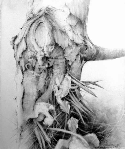
"Mourn the Passing of a Tree" by Kathy Gomric. First Place, Drawing Attention (2014) |
|
First Place
Sisters
Graphite Drawing by Steve Femmer
|

Second Place
Bound for Deliverance
Pencil Drawing by Bart Wayne
|

Third Place
Cuivre River Bank
Pastel Drawing by Linda S. Wilmes
|

Honorable Mention
Old Apple Tree
Colored Pencil Drawing by Karen Bruns
|

Honorable Mention
Bridge Over Rocky Creek
Pastel Drawing by Melanie Priest
|

Honorable Mention
“Say Wh-a-a-at?”
Colored Pencil Drawing by Jan Foulk
|
|
CLICK HERE TO VIEW THE EXHIBITION ALBUM
|
People's Choice Award
My Virtual Senior Year
Pencil Drawing by Sean Breen
|
Juror's Statement: What drew my own attention, upon encountering the body of work to be reviewed, was the diversity. There was a decent range of drawing media employed. A number of works were achromatic while many others were quite colorful. Visual vocabularies ranged from tightly rendered realism to expressionistic abstraction. While most works were representational, a couple were nonobjective. Some artists engaged themselves in the laborious but rewarding process of rendering their subjects with limited embellishment or distortion. For these artists, no doubt, mastery of technique and accuracy of depiction mattered greatly. Other works emphasized \\eative interpretation of subject matter and experimentation with materials and methods.
I find that, when jurying a show, I need to tune into what I perceive to be each individual artist’s particular goals, and to assess based on that understanding – as well as on the pure visual impact of his or her work. Many of the drawings in the exhibit were successful in both these regards and, truth be told, I could have easily come up with different selections for the awards since I found so many works to be noteworthy. It was a difficult process of narrowing down my initial list of potential drawings to highlight. I’d like to share some thoughts about the award-winning pieces, below.
Sisters: A tightly rendered image that initially seems to be a straightforward, skillful, dispassionately-produced double portrait of girls seen in ¾ view. But there is more going on here, I believe. There are some genuinely smart and sophisticated artistic choices. Like contrasting the girls’ beautifully modeled facial features with the unapologetically flat treatment of their blouses and environment, thus intensifying the focus on the faces. Like limiting the tonal range, thus giving the image a light, airy, delicate “feel.” Like stylizing the hair of the subjects so that it is both modeled and linear – I found myself fascinated by this. Clearly, verisimilitude plays a part in this image. But, then, so does a stylization that lends it a haunting and timeless character.
Bound for Deliverance: I seriously doubt that anyone could deny the visual power of this piece. Its economy, scale, impressive rendering technique, use of near-symmetry, and provocative imagery all combine to demand the viewer’s attention.
Cuivre River Bank: There were a number of very strong pastel drawings among the entries. Several really stood out, but none more so than this one. The drawing is composed well and demonstrates a masterful use of the medium. Varied textures abound in the image. I especially appreciated the fact that, while the image works coherently and effectively from a distance, my “reading” from up close was less about the peaceful woodsy scene and more about my immersion in – and appreciation for – the artist’s technique. From up close, one gets to see the expressive layering of hundreds of colorful marks. The technique seems akin to that of the Impressionists, relying on optical blending from a distance, while preserving the purity of the many individual gestural marks on the surface. So well done.
Old Apple Tree: Such an impressive drawing. I have no doubt that the artist was very observant, carefully studying the forms, colors, textures, and lighting of the tree. There is enough objective information provided in the image that I could probably use it to identify this specific tree in a crowded orchard. But there is much subjective response here too. The rendering style is so expressive, so gestural, so emotive! I love it.
Say Wha-a-a-at? : I challenge anyone not to smile when looking at this drawing. But I think that this work is more than a one-off smile-maker. The technique is impressive, the textures so well-rendered and nicely contrasted, and the depth so convincing, that the drawing is much more than simply cute and entertaining. It demonstrates real skill and is worthy of recognition.
Bridge Over Rocky Creek : Again, I noted a number of terrific pastel drawings in the mix. Part of the draw (pardon the pun) of this image is simply the inviting, peaceful site it depicts. But the handling of the medium is noteworthy, as is the wonderful quality of light that permeates the scene.
Juror: Bob Langnas is a printmaker, painter, and mixed-media artist. Much of his studio work deals with the theme of entropy and its societal implications. He received his Master of Fine Arts degree from the University of Pennsylvania in 1991. He has also studied at Harvard University’s Graduate School of Design and the Philadelphia College of Art (University of the Arts)
Langnas has an extensive exhibition record and has judged approximately 30 shows. He has served on the Special Exhibitions Committee of the St. Louis Artists’ Guild, the Forums Committee of Art St. Louis, and the Artists' Advisory Board of the
Foundry Art Centre.
He has been a full-time faculty member in the nationally-accredited art department at St. Louis Community College’s Florissant Valley campus since 2000. Prior to taking that position he taught at Culver-Stockton College (Canton, MO) and Delaware County Community College (Media, PA).
Since 1990 he has taught all levels of drawing, design, painting, printmaking, illustration, and art history. He has also given numerous art-themed lectures and workshops to community and academic groups over the years. Learn more at boblangnas.com.